Tuesday, December 30, 2014

Money - Facts and Figures [Infographic]

We all know what money is, right? We all use it, we go to work every day to earn it, we pay our bills with it. It's a part of everyday life. However, most people never think about what money really is. How it can be defined, what functions it has and what makes it valuable in the first place.

Generally speaking, money is a set of assets that is commonly used and accepted as payment for goods and services in an economy. So basically everything can be considered money, as long as it fulfills certain criteria. 

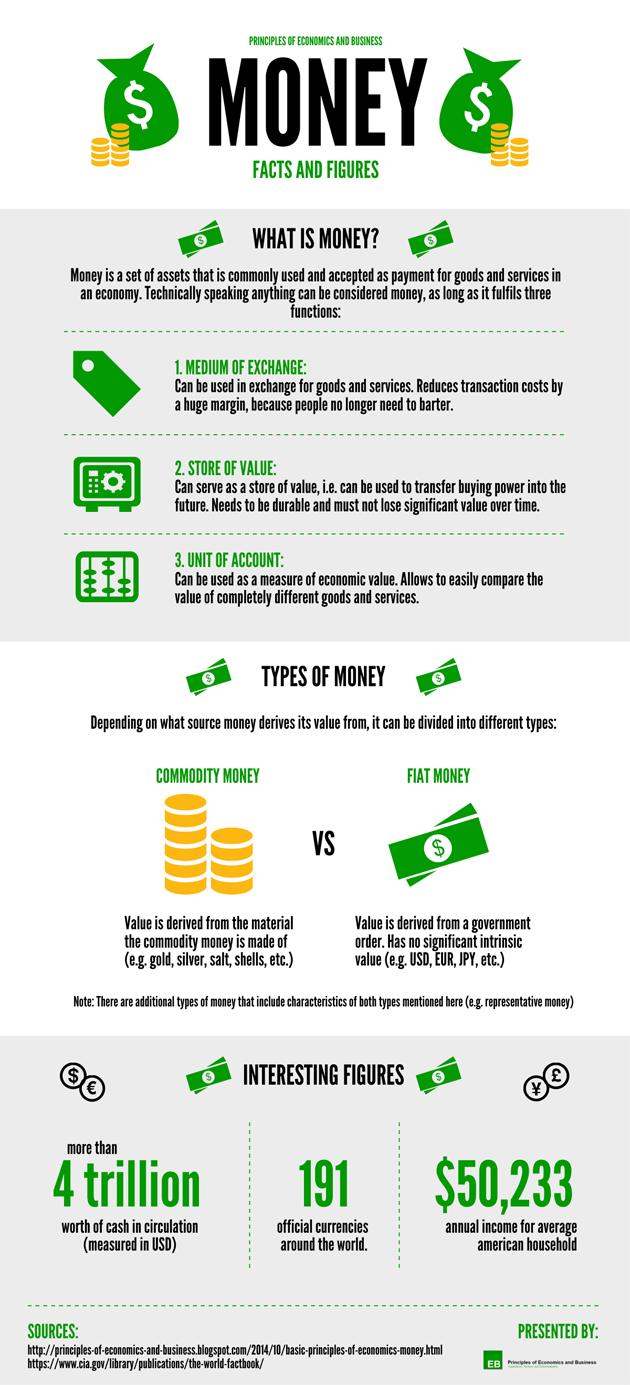
To explain this in more detail, we have created an infographic that displays some of the most relevant and interesting facts and figures about money. Take a look:


Infographic - Money: Facts and Figures


Embed Code

Sunday, December 21, 2014

JFDI, MBIE!

There is a bit of a ruckus going on about the performance of MBIE, the Ministry for Business, Innovation and Employment, based on this report. I'm not interested in the point-scoring argy-bargy, though for what little it's worth I agree with the reviewers who noted (p58) their "impression of highly motivated and capable staff, doing things the hard way because they are struggling both to prioritise their efforts and to see the broader strategic context for their work".

What's irked me a bit is that there are three ideas that have gone into the MBIE hopper and haven't come out yet, even though all of them look good (or even very good), would be easy to implement, and would make the New Zealand economy a more competitive marketplace.

The first one, recommended by our Productivity Commission, and conveniently investigated in detail in an Australian context by the Aussies' Competition Policy Review, is to review s36 of the Commerce Act, the bit that aims at stopping companies with market power from interfering with competition. My conclusion, on reading the Aussie report, was "Save the time and money" on our own reinvention of the wheel at MBIE. "I say we send the Aussie Review members a thank you note and a couple of cases of our best Pinot Noir, declare victory, and go home". I know there are people in MBIE, and elsewhere, who thinks it's a big, complex issue, despite the Aussies having fortuitously solved it for us. It isn't.

The second one, again recommended by our Productivity Commission and also standard practice overseas, is to let the Commerce Commission conduct proactive fossicking ("market studies") into the state of competition. It can already do it in the telecoms market, but not generally. It would take part of a morning to write the amendment to the Commerce Act.

The third one is the state of our anti-dumping regime, which is too easily abused and which allows domestic producers to avoid competition from overseas and to rort the local consumer. In June 2014 MBIE came out with a good paper with three options, one of which clearly outclassed all the others. As I said at the time, "this should be the easiest, "where do I sign", shoo-in of a policy contest that's ever been run". So why hasn't it been?

Tuesday, December 16, 2014

Time for an interest rate cut?

"At 3.5 percent", said last week's Monetary Policy Statement, "the OCR" - the official cash rate - "is still providing support to demand".

Now, there's a sense in which this is true: a "neutral" rate, neither supportive nor contractionary, is reckoned to be around the 4.5% mark, so 3.5% is clearly on the stimulatory side.

But in terms of the overall tightness of monetary conditions, you can't look at the cash rate in isolation. It's the combination of interest rates and the exchange rate that makes life easier or harder for people and businesses. An OCR of 3.5% may be "providing support", but that doesn't mean a lot if the Kiwi dollar is so high that exporters are severely constrained. True, it would be better than 4.5% and a high Kiwi dollar, but that would be a rather moot consolation.

So here once again is my calculation of the overall tightness or otherwise of monetary conditions, as captured by the old Monetary Conditions Index, which mashes together the 90 day bank bill rate and the trade-weighted index of the Kiwi dollar into a single overall number.


The reality is that overall monetary policy conditions are tight. Tight, tight, tight. They're on a par with periods in the past when we were dealing with reasonably serious inflation pressures.

Not that there's a lot the Reserve Bank can do about it, as there's no feasible OCR that would bring monetary conditions back to neutral, let alone to the stimulatory side of neutral.

If you said that "neutral" is some kind of long-term average of the Monetary Conditions Index, then neutral would be about 500 (averaged over the whole history of the series since mid 1986) or about 350 (if you start in January 1991 after the initially brutal disinflationary period). The current MCI is around 1200: to get it to a neutral level around the mid 400s, you'd need a negative OCR at -4.0% or so.

Alternatively, if the OCR stays at 3.5%, you'd need the Kiwi $ to be roughly 14% lower for overall conditions to be neutral - say in the high 60s against the US$ rather than the current high 70s.

However, you look at it, though, you begin to come round (as I also did a wee while back) to the conclusion that, with the best intentions, and on the best decisions made in the light of the best info at the time, we've nonetheless ended up tighter than we ought to be. I've a great deal of sympathy for the view (as put by John McDermott, the RBNZ's Chief Economist, at last week's MPS press conference) that monetary policy making in real time is an evolving process of learning and adaptation as you go along. I'm beginning to think that the next step in the process ought to be a few steps backwards for the OCR.

Monday, December 15, 2014

Never mind the deficit

I've just spent the morning, with the rest of the usual journo and economist suspects, in Treasury's lock-up for the Half Yearly Economic and Fiscal Update. Though sometimes I wonder why I bother: Bill English's press handout essentially said that the numbers on the fiscal outcome aren't worth the paper they're written on ("Previous forecasting rounds show the outlook can change significantly between the Half Year Update and the final accounts being published").

No doubt most of the media coverage will be along "Government misses its fiscal surplus target" lines: the government had planned a fiscal surplus of  $297 million for the year to next March, and it now looks like a fiscal deficit of $572 million. And even the forecast surplus for the year to March '16 ($565 million) is partly the result of a bit of jiggery-pokery with the contingency allowance the government has for possible future spending.

But I don't give much of a hoot about that, and neither should you, for several reasons. For one, the fiscal surplus or deficit is the difference between two very large numbers (government revenue and spending), each around the $72 billion mark, and very small changes in the very big numbers can make fiscal surpluses and deficits appear and disappear, just like that (as Tommy Cooper used to say). For another, there's an entirely plausible, and benign, reason for the forecast surplus becoming a forecast deficit: inflation has turned out to be lower than expected, which means the tax take in dollar terms is lower than expected. It's not, for example, the result of letting government spending rip (spending is actually gently drifting down as a share of the economy). And for yet another, while a deficit of $572 million sounds like something substantial, it's actually only 0.2% of GDP. However you look at the "missed the target" angle, it's no biggie from an economic perspective.

There were more substantial things to focus on. I was especially interested in what Treasury's forecasts for GDP growth would look like, given that last week the Reserve Bank had upped its expectations for the economy. It's encouraging.


It's possible, too, that there's more than the usual business cycle going on here: both the Reserve Bank, and now the Treasury, have begun to wonder whether the long-term growth rate of the economy ("potential output") hasn't picked up a bit (it's one of the alternative scenarios that Treasury looked at in the Update). Some of it is down to big increases in business investment, some of it down to high levels of net immigration (we're expected to gain 52,400 people in the year to March, and keep gaining people in future years, though not at the current clip). As Treasury noted, many of these people are of working age, and "the skills, ideas and international connections of the migrants are assumed to further increase productivity growth". Xenophobes, please note.

Two other things caught my eye.

With the caveat that whatever the reliability of fiscal forecasts, exchange rate forecasts must be an order of magnitude more flakey again, Treasury is currently picking that the overall value of the Kiwi dollar isn't going anywhere over the next three years. Most of us have been operating on the assumption that the Kiwi dollar is "too high" and will drop in the none too distant future: maybe it isn't going to happen.

And the other thing is the outlook for what we earn on our exports compared to what we pay for our imports (the "terms of trade"). The working assumption is that yes, we're suffering on the dairy front at the moment, but other commodities will keep us going, dairy will recover in the end, plus we're paying a lot less for the oil we import. Maybe that's how it will indeed play out, fingers crossed, but it's a reminder that we're still vulnerable - arguably too vulnerable - to the vagaries of the commodity markets.

Saturday, December 13, 2014

Good Deflation vs. Bad Deflation

Deflation is often considered a highly unfavorable phenomenon. Although the idea of falling prices may seem appealing (at least from a consumer perspective), deflation is mentioned amongst the worst things that can happen to an economy.

However there are different types of deflation that have different implications. In other words, the effects of deflation depend to a large extent on the particular context. Thus it becomes quite obvious that deflation is a rather complex issue. To keep things simple we shall distinguish between good deflation and bad deflation

Good deflation

Good deflation is generally caused by a positive supply shock (i.e. an outward shift of the supply curve) that leads to the production of higher quantities sold at lower prices. In most cases, this type of deflation can be attributed to technological progress. New technologies allow companies to improve their production processes and reduce costs. As a result, the price level falls and (relatively speaking) money becomes more valuable.

An example of good deflation is the development of flat screen televisions. When they were introduced a few years ago, not many people could afford to buy one, because they were quite expensive ($3'000 - $4'000). However due to technological progress and improved production processes a flat screen television only costs about $600 - $1'000 these days. 

This example illustrates why certain forms of deflation are considered "good". On one hand consumers obviously profit because they can afford to buy more things with the same amount of money, thus they become more wealthy (relatively speaking). On the other hand suppliers can also profit from the deflation (even though prices fall) because they can reduce production costs simultaneously. This has to hold true because good deflation is triggered on the supply side.

Bad deflation

Bad deflation is caused by a negative demand shock (i.e. an inward shift of the demand curve) that leads to the consumption of lower quantities at lower prices. In other words, sellers have to reduce prices, because there is a lack of demand and they cannot sell their goods at the original price anymore. This is problematic in several ways:

  • When prices fall, people tend to postpone purchase decisions because they expect prices to fall even more. That can lead to a vicious circle, since postponed purchases result in lower demand which in turn drives prices further down.
  • The burden of depts increases, as the price level decreases. That is, if you were to borrow money today, the amount you would have to pay back in a year would be worth more. Admittedly, lenders profit from this situation. However, since they usually only spend a portion of the additional income, the economy will experience an additional decrease in overall spending (and thus the vicious circle mentioned above will be amplified).
  • As a result of the lower revenue, companies will have to reduce costs. Because of sticky nominal wages (i.e. the fact that wages cannot be lowered without provoking resistance), they will have to let people go, thereby causing an increase in unemployment.

To illustrate this we can look at the financial and economic crisis in 2008. The burst of the "housing bubble" in the United States combined with several other factors (easy loans, questionable business practices, etc.) caused prices to fall significantly over a very short period of time. As a result, trillions of dollars of value were destroyed and both investors and consumers became increasingly cautious and restrained. However this exacerbated the situation, resulting in a vicious circle.

The example above illustrates why those forms of deflation are considered "bad". At a first glance it may look like consumers are better off. However, there are significant negative effects on suppliers that will eventually affect consumers as well. This form of deflation is especially problematic, because of the self-amplifying nature of the process that can ultimately lead to a deflationary trap.

In a nutshell:

Deflation is widely considered a harmful phenomenon for the economy. However, we need to distinguish between deflation caused by a negative demand shock (i.e. bad deflation) and deflation caused by a positive supply shock (i.e. good deflation). Bad deflation causes a vicious circle, because people postpone purchase decisions, the burden of dept increases, and unemployment rises due to sticky nominal wages. Good deflation on the other hand is mainly based on technological progress and can actually be beneficial for both consumers and producers. In conclusion it can be said that deflation may be bad, but it does not necessarily have to be.

Wednesday, December 10, 2014

Growth, inflation, and spongey brakes

Today's Monetary Policy Statement from the Reserve Bank didn't have any headline surprises - the official cash rate was kept at 3.5%, as everyone had expected, and any eventual increase is now pushed out to late 2015 or early 2016, again much in line with current market expectations.

There had been some talk that the Bank had been a bit premature with its interest rate increases - there were questions at the post-match press conference about whether the Bank had tightened too much, or had expected more inflation than has actually happened - and even that its next move might need to be a cut in interest rates. Governor Graeme Wheeler ruled that out - "we're not anticipating a cut at this stage".

So all much as expected, but that said, there was some interesting stuff in the body of the Statement.
One big thing that stood out for me was the stronger track now being forecast for GDP growth: I'd been somewhat concerned about what happens to our growth rate when the Canterbury rebuild tails off: on the latest forecasts (below), this is looking less of a worry, and all going well we should see the unemployment rate keep dropping, to below 4.9% by March '17.


Another interesting development was lower domestically-generated inflation than you would normally have expected in an economy performing as well as ours currently is. Here's a chart (Figure B1 in the Statement) showing where the rate of domestic ("non tradables") inflation has actually been, compared to where you would have expected it to have been based on the strength of the economy and people's inflation expectations.


You can see that domestically-generated inflation is running about 2.5%, when economic conditions like today's would have led you to believe it should have been more like 3.25% to 3.5%. There was a bit of attempted blame-slinging from the media at the press conference about this, along the lines that that the Reserve Bank missed it (and, implicitly, raised rates too soon or too much). But as I've said before, the Bank was in good company. And in any event nobody yet really understands why it's happened here and overseas ("Research into what has caused inflation to be unusually low continues", as the Statement tactfully put it).

I don't know if John McDermott. the Bank's Chief Economist, was right when he said the Bank was less wrong about this than a lot of other central banks and forecasters. But I certainly agree with his follow-up comment that, rather than looking at it as a forecasting failure, the lower than expected inflation is actually a positive development: it means that economic expansions can be let run for longer, without central banks (as the old monetary policy saying goes) having to take the punch bowl away just as the party has got going.

Brian Fallow, the Herald's eminent economics correspondent, may have added a new monetary policy phrase to the lexicon when he asked a question about long term interest rates*. He noted that the Bank had said (in this speech) that it didn't control long-term interest rates (because they're largely set globally). But in that case, Brian reckoned, the RBNZ may lose control of some mortgage rates: people on longer-maturity fixed rate mortgages will be paying rates essentially set overseas. Will the Bank be left, as Brian put it, with "spongey brakes"?

*Brian tells me since I wrote this that it's not original to him, and he recalls it being used in Alan Bollard's day. Even so, it was a good time to dredge it up.

Sunday, December 7, 2014

Let's get more serious about competition

Australia's Financial System Inquiry, aka the Murray report, came out over the weekend: you can find overviews here or here and the thing itself here.

I was particularly taken with the bit that looked at the interplay between regulation and competition: regulation can often have positive results (such as helping with the stability of the financial system) but it can also reduce competition (for example by writing rules that make it harder for new entrants).

The Aussie report, I'm pleased to say, came squarely down on the side of competition.

First it said that
The benefits of competition are central to the Inquiry's philosophy. While competition is generally adequate in the financial system at present, the high concentration and steadily increasing vertical integration in some sectors has the potential to limit the benefits of competition in the future. Licensing provisions and regulatory frameworks can impose significant barriers to the entry and growth of new players, especially those with business models that do not fit well within existing regulatory frameworks
And its Recommendation 30 consequently says that Australia should
Review the state of competition in the [financial] sector every three years, improve reporting of how regulators balance competition against their core objectives, identify barriers to cross-border provision of financial services and include consideration of competition in the Australian Securities and Investments Commission's mandate.
The Murray report comes on the heels of earlier reports from the Aussies' Competition Policy Review (which I wrote about here, here and here) which also put competition front and centre in policymaking: all good stuff.

The recommendation that Australia should look at the state of competition in the financial sector every three years reminded me that in June our Productivity Commission came out with its report on raising productivity in  the services sector, and recommended (as I wrote here) that "The Commerce Commission should be able to undertake studies on competition in any specific market in the economy".

Six months later, nowt. As the Productivity Commission says on the services report website, "The Government is considering the Commission’s report and recommendations. No timeframe has been set for the overall response"
.
You're left with the feeling that the Aussies are taking the benefits of competition rather more seriously than we are.

Tuesday, December 2, 2014

Move along, folks

So here's where we've got to with the wholesale price of internet services.

Internet service providers (ISPs) used to buy access to Chorus's copper lines and electronics for $44.95 a month.

This price was too high and insupportable, and everyone knew it (including Chorus, if it's being honest).

And sure enough it's just been lowered by the Commerce Commission, to $38.39.

Good outcome? You'd think so.

But.

Chorus isn't happy. It didn't want it lowered, or at least by not that much.

ISPs aren't happy. They wanted it lowered to closer to $34.44 (the Commission's estimate of the same price overseas).

TUANZ says the ongoing uncertainty over the price is "disappointing".

Could everyone get a grip, please?

Chorus should be happy. It wasn't knocked back all the way to $34.44.

ISPs should be happy. They're getting a too-high price fixed for them - maybe not pushed as low as they'd like, but hey, this is where the technical experts say it really should be.

The government should be happy. Copper prices aren't undermining uptake of the new fibre network the government is subsidising as much as they might have.

Consumers, and TUANZ, should be happy. They've had the reduction in the price already passed through to them in better value broadband plans (if you believe the ISPs), but in any event it should reach them one way or another.

So there are two ways forward.

One is take to the mattresses in another round of rent-seeking from the regulatory process - submissions, counter-submissions, legal challenges, appeals, smoke, mirrors, subterfuge and artifice, enriching only the lawyers and the specialist economists in a negative-sum game.

And the other is to acknowledge a deal that more or less works for everyone, and get the hell on with doing what the various parties are supposed to be doing, which is making money for themselves by providing a better service for us, the consumers.

I wonder which will happen?

Monday, December 1, 2014

KISS

This morning the Commerce Commission released the wholesale price Chorus is allowed to charge to Internet service providers (ISPs), and which therefore is the core component of the retail prices those ISPs charge you for your fixed line broadband.

It's made up of two parts, the first being the bit for the cost of the copper line from your place to a Chorus switch (the 'local loop' or UCLL) and the second ('UBA') being the cost of the fancy electronics that Chorus can (optionally) provide to ISPs to save them having to use their own. The local loop bit will be $28.22 a month and the UBA bit will be $10.17 a month, making a total of $38.39. This compared with the previous price allowed, of $44.98.

These prices are based on explicit, detailed and complex modelling of the costs involved, and are intended to replace the interim hold-the-fort prices that the Commission had previously set, based on the cost of the same services overseas in countries who do things much the same way as we do. This 'benchmarking' exercise had set a local loop price of $23.52 and a UBA price of $10.92, making a total of $34.44.

There are all sorts of issues involved here, big and small, affecting everything from the profitability of  Chorus through to uptake of the country's shiny new ultra fast fibre network. And they directly affect you, too: already some ISPs are saying that the drop in the wholesale price (from $44.98 to $38.39) had already been passed on to you, so you won't be getting any further joy out of it.
In any event, I'd like to pick on one small aspect of the process, even though it's largely moot now, and it's about those interim 'benchmarked' prices.

I think they did a good job of providing a quick, cheap and reasonably accurate initial estimate of the eventual wholesale price. They were pretty much spot-on when it came to the UBA part ($10.92 versus $10.17), which is remarkable given that everyone was agreed that the benchmarking process had only a couple of countries overseas to use as sighting shots. And they weren't far off when it came to the local loop component, either ($23.52 versus $28.22) - especially when you consider that the fully modelled cost estimate involves a whole swathe of judgement calls made by the Commission and its modellers, and is not a glimpse into some eternal truth held in the mind of an omniscient Being.

So I'd take two lessons away from this, both involving the KISS principle.

The first is that over the next couple of years we're going to be taking a close look at the shape of our telco regulatory regime, and I'd like to suggest that we keep the cheap and cheerful benchmarking process. It's relatively fast - a particularly important consideration in fast moving markets like ICT - it's relatively transparent, it's understandable, it's relatively cheap, and it's accurate within some rough-and-ready-justice tolerance. I'd go further, and make it harder for parties to invoke the full cost modelling approach, which introduces layers of cost, delay and complexity, and all for a gain in 'accuracy' that (because of multiple modelling options) may be more illusory than real. And in general I'd like to see the 'good enough' option chosen over the one that keeps consultancies on three continents in business.

The second is that we need to think harder about the increasing complexity and cost of regulation across all sectors, and not just the telco business. I agree with Eric Crampton of the NZ Initiative, when he said on Interest.co.nz that "Too much of New Zealand’s regulatory apparatus would suit a country of forty million rather than the one we have". He's got his own examples: one I came across recently was the Commerce Commission's needing to sign off a $3 million increase in capex spending on a little Transpower project in South Canterbury. The process will take five months from start to finish, and has already spawned a 54 page initial draft decision.

That's a bit of an extreme example, and I should make it clear that it's not the Commerce Commission's fault: it's been lumbered with this ludicrously over-engineered regulatory regime. And I should add that from next April the Commission won't have to get out of bed for anything under $20 million - which is, of course, where the threshold for its involvement should have been in the first place (if not higher again). And I'd have to note that bloodymindedness on the part of Transpower and its customers drew this intrusive regime on their own heads, and a bit of enlightened give and take could have avoided the whole mess.

But it's there now, and it's holding up the sector, and its cousins in other sectors are also increasingly clunky and costly. It's time for more people in the policy analyst community to do what the MD of one company I know used to do: hold up the sign that says, "Does it make the boat go faster?"
Did we move too quickly?

Business Insider Australia put up this fascinating chart yesterday (full piece here).


The gist of the article was that the Fed won't want to repeat the premature policy-tightening mistake made by a range of central banks in 2010/11, including us (briefly and marginally) and the Aussies (for longer, and to a larger extent).

But I was more struck by that little rise in the yellow line at the right of the graph - our most recent tightening moves. They're beginning to look rather anomalous.

I know, hindsight is a wonderful thing, and inflation everywhere has turned out lower than reasonable people would have expected at the time (with the recently plunging oil price adding to the decline). And I've been as surprised as anyone - I also thought the strength of our economy would have led to higher rates of inflation (especially for non-tradables) than have actually occurred.

So I'm not pointing fingers. But on a purely objective basis, knowing where we are now, with a slowing economy and inflation less of a threat than expected, I do wonder whether we've tightened too much, too early.