Showing posts with label well-being. Show all posts

Tuesday, November 3, 2015

How's life? Pretty good

A day when we got news that employment fell, and the unemployment rate rose, may not be the best time to argue that New Zealand is in pretty good shape when compared with the rest of the world.

But that's the case nonetheless, as the latest How's Life 2015: Measuring Well-being report from the OECD shows. The report is part of a growing - and welcome - global focus by various agencies (including our own Treasury with its 'Higher Living Standards' framework) on a wider range of societal outcomes than just GDP.

Here's how New Zealand stacks up against the rest of the OECD on a broad range of economic, social and environmental criteria. The scores are standard deviations above or below the OECD average, and anything bigger than +1 or lower than -1 is pretty unusual. Hat tip, by the way, to Timothy Taylor's excellent Conversable Economist blog, which is where I came across the news that the OECD had done this latest exercise.


Sometimes when organisations do these comparisons, the results don't always resemble the country you know, but this looks about right to me. By international standards, we're on the right side of the ledger for most things - and very much so on the size of our houses, our perceived state of health, the cleanliness of the air and our ability to get people into employment. You can see - if you use the "life satisfaction" measure at the bottom as an overall summary - that we are travelling well by international standards.

Where do we lag? There's nothing outrageously bad, but the one drawback that sticks out, housing affordability, will surprise no-one (here defined as "Percentage of household gross adjusted disposable income spent on housing and hosue maintenance", but we'd have shown up badly no matter which precise measure you used). We also work too much and don't take enough time off, and have a slight issue with educational attainment (and, I'd say, if you peeled back the overall educational showing, a particularly knotty issue with the bottom tail of the educational attainment distribution). And everyone would prefer if we were above the OECD average for household income rather than slightly below. But overall this is a good score-card.

I'm a little surprised we don't have data on all the criteria (if you're interested in the definitions, they're on p26 of the print edition or p28 of the e-book, and these country graphs start on p47/p49). 'Financial wealth' is defined as 'net household financial wealth', and something very much like that is available on the Reserve Bank's website (here). I'd have thought we had the data on earnings and basic sanitation, too. The 'adult skills' measure is the only one where I can see a good reason for missing data: we aren't apparently part of the OECD's Programme for the International Assessment of Adult Competencies (PIACC). Don't know why - the rest of the OECD seems to have signed up (33 of them) - but there you are. But even if you filled in the blanks, it wouldn't (at a guesstimate) have changed the overall picture.

There's much more in this report than just country league tables, and I'd recommend it to anyone with an interest in social welfare broadly defined,  but I suspect people will still want to do the usual comparisons, so here's how Australia looks.


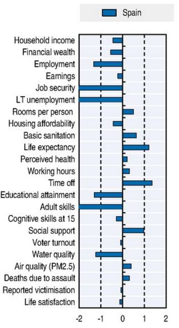
Very similar, but richer, in sum. And if you ever wanted a simple graphic showing the need for structural reforms in some economies, here's Spain.


Tuesday, August 25, 2015

I'm not there! Are you?

Bryce Edwards' Twitter feed pointed me towards an interesting new piece of research from the Lifestyles Research Group at the University of Otago - 'Change, Challenge and Choice: A New Zealand Consumer Lifestyles Study'. It's an interesting insight into our collective beliefs and behaviours, and rings true, sometimes almost archetypically: I was amused to see that one of the statements New Zealanders most disagree with is "I keep my wardrobe up to date with fashion".

This is the sixth instalment of what is now becoming a pretty impressive longitudinal survey (dating back to 1979). The guts of it is a derivation of seven different consumer segments, based on cluster analysis of quite a large survey sample (2,036) and a large number of questions (almost 600). Here is the key result: there's more detail on each segment in the full paper.


The cluster analysis fits the data pretty well, and no doubt marketers, and others, will be thinking up cunning plans to pitch to the different segments.

I've got only one, eentsy issue with it: I don't seem to fit any of the boxes...what about you?

Wednesday, November 5, 2014

The picture of health

This chart, from the OECD's latest Health At a Glance publication, is going the rounds of the social media, and it's a bit of a reality check, in a good way. If you'd thought that we were all going to hell in a handbasket because of binge drinking, bad driving, obesity and all the rest of it, think again.


The graph shows people's self-reported state of health, and we're very near the global top. Even if you take off a positive bias for the way the question was asked in some countries (our score is 5-8% higher than it would be if measured the same as in most countries), we're still well up there.

How people feel about their health is one reasonably important outcome, but if we go away from perception and look at some of the hard numbers, we stack up pretty well, too. Here's life expectancy.


The wealthier OECD countries are all pretty much of a muchness, really, but again we're in a pretty good place. Interestingly, as the next graph shows, we have much less of a gap in life expectancy between the well-off and the poor than exists in most countries. No idea why this should be, but there you go - another pretty good outcome.


From an economist's perspective, it's interesting to see that we've got better health (measured by life expectancy) than you'd expect for a country of our income level, and better health than you'd expect for the amount we spend on healthcare, as the next two graphs show. In both cases you want to be north of the fitted black line, and we are. And it's interesting to see that some of the stylised facts we all 'know' about global healthcare are, indeed, true, notably the hopelessly inefficient level of the health spend in the US.


I know, I know, we could be even healthier again, and if we did a better job of managing the booze, the weight, the fags, the exercise, the diet and the heavy foot on the accelerator, we'd all be even better off. But at the same time we ought to take on board that as far as comparisons with countries like us are concerned, we're already making a pretty good fist of health outcomes.

That "heavy foot on the accelerator" isn't a random comment, by the way. I'm recently back from Ireland, where I couldn't help noticing how much more polite and orderly the driving is than here in NZ. And it shows in these OECD stats, too: neither country is a smash palace along Brazilian or eastern European lines (and America doesn't show to advantage, either), but Ireland's death rate on the roads is clearly lower than ours. Which is something you could think about next time you cut me off on the motorway.